


 |
| My Singapore Passport |
What has Terrorism got to do with Passport? You see, recently I renewed my passport and I must say the online system (APPLES) has made it so convenient to renew our passport now. On collection day I dutifully presented myself at ICA and couldn't wait to lay my hands on the little red book. Finally the tangible feeling that citizenship has its benefits! On flipping the pages, I reeled back in shock and horror.
It was as if dozens A380s had struck our city, bringing down buildings and the nation back to medieval age. Look at my passport page (the 2010 Edition); instinctively you know something is amiss, how come the page looks so "empty"? What is happening here?
 |
| My New Passport, 2010 Edition |
We have lost many of our skyscrapers in the Singapore skyline. These buildings were still around in my old passport (2006 Edition). Luckily the Durian is still sitting stoutly though the fates of Flyer and Sands are unknown. Who are the perpetrators, till now nobody has owned up or apologized for this heinous sin!
 |
| My Old Passport, 2006 Edition |
How could they have done this? The one who approved the design should be
**********
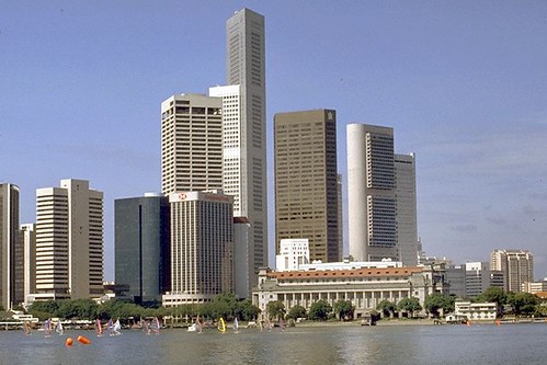
Compare the 2010 passport page with the below 2009 photo of the Singapore skyline. The difference is too big to escape any pair of eyes. After digging around, I found out they based the new page design on a 1980s photo of the Singapore skyline.
 |
| 2009 Singapore skyline (Source: Wikipedia Commons) |
By juxtaposing the Esplanade with the 1980s skyline, are they trying to show the world how much Singapore has progressed in 20 years? The funny thing is that in my old passport, the page design shows a newer version of the skyline. Granted they intended to show progress in the new page design but why is the Esplanade (completed in 2002) in my new passport? For the 2010 edition, they could have put Sands or Flyer or even Universal Studios - the current poster boys. Esplanade is passe.
* To answer my own question, perhaps by putting a landmark related to the performing arts, they are trying to present Singapore as a vibrant cosmopolitan society that appreciates the arts in the same fervour as the worship of mammon. Don't believe me? Look closer at both my passports, the skyscrapers are now smaller - de-emphasized - compared to in the old design and the Esplanade is presented rather disproportionately as if to emphasize it.
As to why an outdated landmark is used in my 2010 passport, the simple reason could be they are just too lazy to update the design to make it more relevant. It has been 4 years since the new biometric passport was introduced and many new landmarks were added after 2006. A more sinister reason could be they printed too many passports due to anticipating but overestimating the huge influx of foreigners joining our ranks of Singapore citizen.
While I applaud their good intention - sinister or otherwise - I am just worried our current passport will mislead newly-minted immigration officers in other countries that what they see is what they get, i.e. that is all there is to the Singapore skyline. They might also wonder what is that pair of insect eyes doing in our country.
Hey please don't tell me updating the design to make it relevant every year is expensive or cannot be done. After all we paid $70 for our passport.


14 comments:
Wah, very sharp eyes! I never look at the pictures in all my new passport. I doubt foreign immigration officers have time to do so. You have just put somebody in hot soup. Chin chai lah!
Our government is very particular about branding. But how come, when our ministers go overseas, their sharp-eyes should spot the outdated skyline in the passport.
I feel that The Esplanade, as the major centre for arts and cultural performances, is more significant than Sands or The Flyer. Some countries also have an arts icon, but The Durian is unique and can be identified with our Country.
Icemoon, maybe they also wanted to show a "Then and Now"?
In any case, you should be very careful of what you say on your blog. Didn't you read about the blogger who was arrested for saying that someone in power should be burnt? You just won't know - some big shot may be behind the design hor.
Interesting.... Perhaps someone thought the lines of the 80's skyline were more aesthetically pleasing to the eye than the current one. The newer skyline doesn't really have a "shape" like the old one.
Just a thought....
Rick
Nothing can be more unique and local than the Esplanade, it is our equivalent of Sydney Opera House. But I doubt the Esplanade is as famous as the Merlion or Changi Airport Tower to be identified with our country.
Victor, that netizen kind of had it coming, using ambiguous words in CAPS which misled the one responsible for his arrest. I used 'severely reprimanded', alternatively I could have used 'redeployed' if really a big shot was involved in the design.
Rick, agree on the aesthetic part. But this just shows their rigidity and lack of creativity. They could have used an aerial view of the Bay, in one shot promoting the Flyer, Esplanade, Sands, Skyline etc.
Let's hope the next edition/reprint of the passport will be better.
I was thinking why the man used the word burn. When you scold people, this word doesn't come naturally. But, if he was thinking of the MP who was burnt, then the inciting violence intention is not improbable. If he had used vulgarities, then nothing would happen.
fr, I think he was referring to the career being burnt.
We even need speak good english campaign, he should have realized not everyone (for eg. the police) can appreciate good english like him.
Icemoon. I think you read too much into the intentions of the designer. I think he is just a simple Singaporean who loves durians.
With you amazing IT skills, you should do a 'what it should be' version and share with us.
icemoon, i am not so concerned about the pictures on the pages of my biometric passport. i am more concerned about my own photo. both times this year when i entered australia using my new passport, i had problem at the immigration. i would be asked to step aside while they studied my face profile from different angles. but i never have any problem when i visited sabah, sarawak or johor bahru using the new passport. my passport photo is so badly distorted that it does not look like me at all.
Lol, oh dear. Maybe they just didn't pay much attention to the design. Or maybe who knows they are in the midst of re-designing when you posted this! >.<
The terorism is dangerous, be careful with it. By the way, I like a traditional Indonesia fashion....thank you. Baju Kebaya
Post a Comment